Ok, time to add my little grain of sand to this, and try to help other Affinity Designer users.
First of all, for the most part the tutorial by Pachyderm (
@dmnCrawler) is what you need. The problem I found with it is that it seems to work for Affinity Designer 1, and not for Affinity Designer 2. Or maybe Tayda changed something, I really have no idea, but I followed it and still kept receiving the "There's no data in your WHITE and GLOSS layers" warnings over and over. So, I decided to look for information out there and keep trying things until it worked. And after 5 or 6 attempts, I finally got something that worked, and my pedals printed.
So, here's what I used to get my pedals printed by Tayda, using Affinity Designer 2.
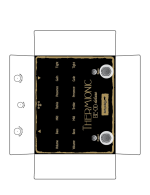
Of course, the first thing you need to check is that your document has at least 300dpi. And that the size is correct. I used 300dpi, and the correct size for the 1590BB I intended to print:
View attachment 53827
Then check you're using CMYK colors (in my case, I used the SWOP profile since it's a pretty common one):
View attachment 53828
After that, just create your art following the usual indications: create three layers (GLOSS, COLOR and WHITE), and place all the color in the COLOR layer, and the appropriate shapes in the WHITE and GLOSS layers.
Remember that colors shouldn't overlap. That means that wherever a color is on top of another, you should subtract the top shape from the bottom shape, like this:
The composition:
View attachment 53829
And the subtraction to the bottom shape:
View attachment 53830
Also remember to convert all fonts and basic shapes (circles, boxes) to curves (select the object and choose
Layer >
Convert to curves). Grouping curves seems to have no negative impact, so use that if it helps. Same for joining curves (I used that for the special layers).
On to the special layers.
After you have everything you need in each layer, you need to apply the special spot colors to the white and gloss layers. Depending on how you have your objects, you can do this at once or you may need to select the specific object and apply to fill and stroke independently.
But first, you need to import the spot colors palette. You can use Pachyderm's palette from the tutorial, or use mine (it's identical) if you want:
https://vilaeffectors.com/external/tayda/Roland_VersaWorks_spots.afpalette
Import this palette as an
Application Palette:
View attachment 53831
This will allow you to use it for other designs in the future. But if you just need it for this document only, I think importing it as Document Palette works too.
Verify that the palette is imported from the palettes menu, by selecting it:
View attachment 53832
And then check that the color names are correct:
View attachment 53833
Now, you need to apply these two colors to the corresponding objects in the layers (WHITE and GLOSS). In my case, I just joined all the objects together and applied the color (I had no strokes in the curves). But you can do it object by object if needed, making sure everything in that layer has only the corresponding spot color.
After you apply the colors,
it's really important to check that the colors are correctly applied. Select all the objects in the layer and check that the color name in parenthesis is the correct one:
View attachment 53834
It should appear as a single color (not CMYK, just s single slider for the color), and the name should be there. If you see empty parenthesis "()" then the spot color won't be used in the PDF. Don't worry if you see the color repeated on top of the parenthesis. That means that the color is a global color. The important part is the name inside the parenthesis, that indicates that it's a spot color.
After you check that, your document will be ready to export. So select
File >
Export... from the menu, and select the PDF format.
To export my file, I chose "PDF (for print)". And at the end of the options, verify that "Honours spot colours" is checked, and uncheck the "Allow advanced features" option:
View attachment 53835
If all goes well, your PDF file will be ready for Tayda. Now, if you want to check it, you can use Acrobat Reader to verify that the layers are there. Just download the app and open the PDF with it. Then select the layer icon from the left, and you'll see the three layers there:
View attachment 53836
Don't worry if the order of the layers seems inverted, you can verify that they work by clicking on the visibility icon (eye) from bottom to top, and you'll see that they correctly disappear in order (gloss will be on top, covering color and white).
These are the steps that worked for me. If you see that you still get the "data is not present in the layer" warnings, just let me know. Cheers!