Danbieranowski
Well-known member
Nah I just dragged the slider to black and didn't pay attention to the values.Is this CMYK 0,0,0,100% or a rich black? Either way I dig the execution
C 72
M 68
Y 67
K 88
Nah I just dragged the slider to black and didn't pay attention to the values.Is this CMYK 0,0,0,100% or a rich black? Either way I dig the execution
I think you will be ok with less than a 10th of a mm. Specially if it is on the small side. The roland swatches should work but I have not gotten my whites to be white yet. Others have and hugo said they were right non my last file I sent him but I have not ordered the pedals yet.Any word on this?? just checked my PDF export and it's 89.91mm X 115.57mm whereas my document in Affinity is 90mm X 115.48mm
Also. I've just used the Roland Swatch..or do I need to manually input some 'spot' colors??
Thanks!
You can adjust it by going to pixel size in Affinity instead of mm. I got away with .1mm but will be adjusting from here on out. Not worth the hassle of a redo!Any word on this?? just checked my PDF export and it's 89.91mm X 115.57mm whereas my document in Affinity is 90mm X 115.48mm
Also. I've just used the Roland Swatch..or do I need to manually input some 'spot' colors??
Thanks!
CHA-CHING!Gave in and subscribed to Illustrator today. It is so frustrating trying to figure this software out after the ease of use in Affinity.

Great share. It is his channel that I have learned most of what I know how to do from. Good resource. I still have so much to learn.For those who work with inkscape or want to get into it i just found this guys youtube channel and the tutorials on it seem great.
How do you like just the color vs having a varnish layer? And how well do you think it will hold up to abuse?Here's what straight black print looks like on a black sand enclosure (no gloss coat). It's basically just a ghosted image. You can see it more depending on your angle and the light. In this case, this is what my buddy wanted it to look like (matte black print on a matte black sand enclosure). I think it actually looks pretty cool for a true blackout pedal.
View attachment 11772View attachment 11771

Thanks.For those who work with inkscape or want to get into it i just found this guys youtube channel and the tutorials on it seem great.
It also helps to dwonload the latest version which is the one you need to follow those tutorials. I have been using inkscape for awhile for my normal water slides and I'm so used to it.Thanks.
I've had Inkscape for ages, still hit and miss in getting it to do what I want it to.
It's just some of the functionality in inkscape that is very CPU intensive and can crash the system, like tracing a complex bitmap.My computer's probably too old to run the latest of anything.
I'm just the opposite, having started with illustrator, I'm finding Affinity a bit confusing, but haven't really given it the effort, as I tend to default to what I know and that's illustrator, which I'm only barely functional in.Gave in and subscribed to Illustrator today. It is so frustrating trying to figure this software out after the ease of use in Affinity.
I’ve seen reports of the graphics being fragile but I’ve never used a varnish layer and never seen a graphic scratch off, even trying pretty hard with a fingernail. I’m guessing it depends on the color how well the ink will adhere to the surface, but so far no issues here.How do you like just the color vs having a varnish layer? And how well do you think it will hold up to abuse?
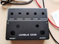
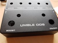
nice, what "D-style" PCB are you building?This is my first try. Designed in Affinity. I have used Roland swatch for the white and I have no problem with the colour. This was one layer of white with gloss varnish. The 9V icon is in black colour with a gloss varnish on top.
This matte black enclosure has a really nice texture in combination with the glossy colour. I like this combination. And I would probably use a second layer of white next time to make it pop more. If you do just thin lines it is not that obvious but you can see enclosure texture and colour on the larger areas under the paint.
Umble from ROGnice, what "D-style" PCB are you building?
")
Also try a white on the color layer. I am thinking that will make it stand out more without the added pass fee.This is my first try. Designed in Affinity. I have used Roland swatch for the white and I have no problem with the colour. This was one layer of white with gloss varnish. The 9V icon is in black colour with a gloss varnish on top.
This matte black enclosure has a really nice texture in combination with the glossy colour. I like this combination. And I would probably use a second layer of white next time to make it pop more. If you do just thin lines it is not that obvious but you can see enclosure texture and colour on the larger areas under the paint.
I thought you are not supposed to have any white in color layer?Also try a white on the color layer. I am thinking that will make it stand out more without the added pass fee.