Did I set up this PDF correctly for Tayda UV printing?

The Robot Devil

New member
I've ordered one pedal from Tayda with a UV print and that one went through with a little bit of issue, but I was able to sort it. That pedal was entirely printed in white, I've never done a colour pedal before.

I think I have done everything correctly, but would someone with more expertise than I mind taking a look for me?

I have it currently set up to print in both colour, with a white underlayer to make the colour pop a bit more.

Thank you so much!
 

Attachments

  • Ipotane Pedal.pdf
    462.4 KB · Views: 9
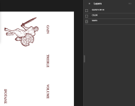
Items in the white layer don't have the proper spot color (RDG_WHITE) applied.
1717615870443.png

Another point: If the file will not include a gloss layer, you should be able to just omit the GLOSS layer entirely since it's empty.

If you want to update your file and post here or send to me via DM, I'd be happy to take another look at it.
 
Thank you for that tip.

I only have access to Illustrator through the library. So, I will fix this up this Saturday when I can get back.
 
Thank you for that tip.
Given your circumstance with having to make a special trip somewhere to get back to this, I've applied the RDG_WHITE to all objects in the WHITE layer for you in the attached file. I did not change the resolution (imported DPI was 192), size, or COLOR layer settings.

I did not want to take any liberties with this one since it's not mine, but it's worth considering slightly increasing the weight of the font on the COLOR layer. Increasing the weight slightly will improve legibility and prevent unintentional white layer "ghosting". By applying *some* COLOR layer bleed over the WHITE layer, you lessen the risk of seeing any inaccuracies on alignment of the WHITE/COLOR layer when it's printed by Tayda.

I hope this helps!

EDIT: I removed the file that was uploaded yesterday because the faun character was not present in the white layer as intended. Thank you @Fama for bringing this to my attention. If you, @The Robot Devil, have a vector or a link to the vector for the faun, I can replace it for you. Otherwise, it's going to require a substantial amount more work to get this embedded image to work as you intended.
 
Last edited:
Given your circumstance with having to make a special trip somewhere to get back to this, I've applied the RDG_WHITE to all objects in the WHITE layer for you in the attached file. I did not change the resolution (imported DPI was 192), size, or COLOR layer settings.

I did not want to take any liberties with this one since it's not mine, but it's worth considering slightly increasing the weight of the font on the COLOR layer. Increasing the weight slightly will improve legibility and prevent unintentional white layer "ghosting". By applying *some* COLOR layer bleed over the WHITE layer, you lessen the risk of seeing any inaccuracies on alignment of the WHITE/COLOR layer when it's printed by Tayda.

I hope this helps!
That's amazing! Thank you so much.

I'm a complete an utter beginner with Illustrator, so even simple things take me some time. I really appreciate this.
 
Given your circumstance with having to make a special trip somewhere to get back to this, I've applied the RDG_WHITE to all objects in the WHITE layer for you in the attached file. I did not change the resolution (imported DPI was 192), size, or COLOR layer settings.

I did not want to take any liberties with this one since it's not mine, but it's worth considering slightly increasing the weight of the font on the COLOR layer. Increasing the weight slightly will improve legibility and prevent unintentional white layer "ghosting". By applying *some* COLOR layer bleed over the WHITE layer, you lessen the risk of seeing any inaccuracies on alignment of the WHITE/COLOR layer when it's printed by Tayda.

I hope this helps!
Did you intentionally leave the faun warrior out of the white layer? It was in the original, so that might be a mistake. Or at least that's how my browser is showing it.
 
Did you intentionally leave the faun warrior out of the white layer?
It was not intentional, no. It appears that the original uses an image for the faun which may explain why the spot color didn't cover that in the white layer. I'm removing the PDF from my previous post, thanks for bringing this to my attention.
 
If you, @The Robot Devil, have a vector or a link to the vector for the faun, I can replace it for you. Otherwise, it's going to require a substantial amount more work to get this embedded image to work as you intended.
I felt kinda bad for missing the faun in the WHITE layer in the file I posted yesterday. Knowing that you have limited access to Illustrator, I found the original image that you used and quickly vectorized it. I've replaced the original image with a vectorized version of the image. I color-matched the existing image for the faun in the COLOR layer and placed an identically sized image in the WHITE layer with RDG_WHITE applied. Unless @Fama calls me out on something else I've missed ;), this file should work a little better for you @The Robot Devil.
 

Attachments

  • Ipotane Pedal_Revised_2.pdf
    72.5 KB · Views: 8
I felt kinda bad for missing the faun in the WHITE layer in the file I posted yesterday. Knowing that you have limited access to Illustrator, I found the original image that you used and quickly vectorized it. I've replaced the original image with a vectorized version of the image. I color-matched the existing image for the faun in the COLOR layer and placed an identically sized image in the WHITE layer with RDG_WHITE applied. Unless @Fama calls me out on something else I've missed ;), this file should work a little better for you @The Robot Devil.
Oh you didn't have to do that, but thank you.

This is such an awesome gesture, thank you so, so much!
 
@Brett sorry to bother you again.

I wanted to edit the PDF you had posted so that the coloured lettering was just a bit bigger than the white under layer as per your suggestion. I opened it up in Illustrator today, and I saw that everything was in one layer. Is that correct, so long as they white and coloured layer are coloured appropriately?
 
No worries! I think this behavior is expected when exporting from Affinity Designer (which is what I used to generate the PDF) and opening in Adobe Illustrator. I know Tayda says not to use Affinity Designer, but I've never had an issue with it as long as you pay attention to sizes and what not.

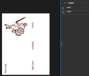
If you open the same PDF in Adobe Acrobat Reader, the layers should appear as follows:
1718233646540.png

If your only option to edit the file is in Adobe Illustrator, you may need to reorganize the objects back into into layers (groups) in order for the exported file to be formatted in the way Tayda expects.

I don't have Adobe Illustrator currently, and it's been a while since I've used it, but if you have any issues let me know and I'll try to help the best I can.
That makes sense, thank you.

Yeah, at this point I have either Illustrator at the library, or I can use Inkscape at home.

How hard is it to learn Affinity?
 
I found Affinity Designer to be relatively easy and intuitive, but I've been using graphic design software for a little while. There are plenty of walkthroughs/tutorials online if you get stuck. I think they also have a free trial if you're not sure if you're ready to commit to purchase.
 
I found Affinity Designer to be relatively easy and intuitive, but I've been using graphic design software for a little while. There are plenty of walkthroughs/tutorials online if you get stuck. I think they also have a free trial if you're not sure if you're ready to commit to purchase.

Awesome. I'll have to check it out when I get back home.
 
Back
Top