Hmm, thanks, I'll keep it in mind. I do have one chromium enclosure which came out pretty darn well, although I haven't dinged it on anything yet so I don't know how easily it scratches or chips. I think that chromium would work great for a robot. And I guess the UV print fill would actually protect the main image at least a little bit, although it could still easily chip on the outer edges, for example. I could maybe also try using a clear lacquer layer on it once I get it - I asked about whether people have tried that before, but got no answers.
Your point about the unpredictable results is a good one, although I was thinking mostly of different kinds of shading, dark/blue shades (but not black), which I assume would translate more or less as intended even if the exact colors aren't quite accurate. But I could also try out gradients. Did you first test the gradients with white and then turn them into the Roland white swatch?
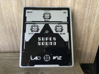
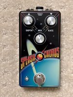
Pic of my chromium enclosure, it looks fabulous in person due to the shiny paint, although I'm less enthusiastic about the graphic than when I did it.
RFC 1149 explanation if you're not familiar with it.
View attachment 46927
 Thanks for the tip!