Font talk

Sometimes AliExpress transistors work.
Just to note, it's Friday night and I'm just an idiot f-in around.
Still figuring out UV prints and jamming Times New Roman over there. No need for this to escalate.
But way I see it, if we'll pay $2 for tayda to drill our 5-9 holes, might as well toss a couple bucks to a creator.
It's serious business, but not that serious. Unless it's Vertex doing it. Then, game on.
 
@benny_profane I'm sure @Big Monk was simply saying that free fonts work but they might look bad. You are right, sometimes they miss glyphs and the kerning can be pretty bad.
I think you are both correct.

I've had way too many unpleasant interactions online, especially on Reddit. Part of that is my fault, my tone isn't always the best. But there sure are grade-A asshats out there. I need to stay away from reddit :)
Personally, every time someone calls me bro or buddy, especially online, I get a condescending vibe and I hate it. However I've had enough interactions with both of you to know this is not the case.

Far from me for daring to tell you both how to feel, of course, but I hope

FofIs5wXoAM8dDh.jpg
 
I’m a Designer, and I’ve designed a couple fonts (mostly pixel fonts, and a couple poster fonts, that are simpler than reading fonts). They’re available for free in my website and GitHub, if you want to use them.

Designing font can be hard, specially if it’s a reading font. Adjusting kerning pairs is a drag, as is creating alternates. Making a complete font, that supports a lot of languages can be a really long process, specially if you support non Latin scripts. If you want to include Asian languages like Japanese or Chinese, you have a tedious job in front of you. So in those cases, I understand your license being expensive. If you’ve invested months or even years creating a typeface, then your work should be compensated.

What I don’t get is designers that create poster or decorative fonts that barely support English, asking hundreds or thousands of dollars if you want to use that font commercially. It’s ridiculous. When you see a font, that you want to use for a single product (say, a logo), and the designer asks for 5000$, I normally roll my eyes.

That being say, there are reasonable designers out there. The font I’m actually using for my pedals (called “Minivan”) is from a Japanese designer, and I payed 500¥ (3€) for it, that is a steal, considering it includes kana characters.

So, in my case, I always try to pay for fonts, but if I think the designer asks too much, I will probably use the font as inspiration, and create my own version, modifying things where I see fit (fonts always have quirks you don’t like).
 
You are right, sometimes they miss glyphs and the kerning can be pretty bad.
That’s the point I was trying to make.
Making a complete font, that supports a lot of languages can be a really long process, specially if you support non Latin scripts.
Absolutely. It’s less of a problem for titling or headlines because you can make adjustments, but an incomplete font for text will be a disaster.
When you see a font, that you want to use for a single product (say, a logo), and the designer asks for 5000$, I normally roll my eyes.
I think there is the difference between typefaces for individual hobbyists/freelance designers and institutional purchasers. That’s certainly not that much money for an institution—particularly if it’s going to be part of brand identity or a logotype. But yeah, you’re certainly right.
 
The issue is the letter spacing aka kerning. You can see it looks off and @Feral Feline made it explicit.
A good font will already have good kerning and a designer will know how to adjust it to enhance the looks. Now I'm no expert but I can do a better job than that.
You'll get no argument from me 🙃 
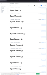
i was being coy and didn't want to go full HAM with my own review. There's also wonky x-height with the "A" but it's also emulating a license/number plate stamped lettering, which doesn't have, say, all the nuance of an HFJ face.

It's a tough line to draw, because one might want to stay faithful to the source. Don't know their intentions. In my own experience, I once created a faithful reproduction of a historic steel mill sign as an all caps font, but the next revision had to be significantly altered to make it actually nice looking typography outside of the original signage. Compromises.

Could it have used some TLC before production? Definitely.
 
I’m a Designer, and I’ve designed a couple fonts (mostly pixel fonts, and a couple poster fonts, that are simpler than reading fonts). They’re available for free in my website and GitHub, if you want to use them.

Designing font can be hard, specially if it’s a reading font. Adjusting kerning pairs is a drag, as is creating alternates. Making a complete font, that supports a lot of languages can be a really long process, specially if you support non Latin scripts. If you want to include Asian languages like Japanese or Chinese, you have a tedious job in front of you. So in those cases, I understand your license being expensive. If you’ve invested months or even years creating a typeface, then your work should be compensated.

What I don’t get is designers that create poster or decorative fonts that barely support English, asking hundreds or thousands of dollars if you want to use that font commercially. It’s ridiculous. When you see a font, that you want to use for a single product (say, a logo), and the designer asks for 5000$, I normally roll my eyes.
I_dBuy_That.jpg
 
I’ve never grabbed a font set that did not 100% work. Just my experience.
It’s around 20% or the time for me that a free font has incomplete glyphs and other non-fatal errors that make them unusable in certain but not all situations

Around 5% or free fonts I’ve downloaded have been completely DOA

My higher rate of issues may be due in part to me often sorting fonts on DaFont by newest so I can see what interesting new free fonts are out there. The more downloads a font has, the more likely it is to be problem-free; established/well known free fonts are a lot more thoroughly tested than brand new fonts where by downloading it you’re essentially a beta tester
 
But seriously, sometimes I find I like the free version of a font BECAUSE of its deviations.

I find this to be far more true outside of sites like dafont, though. Some on there are just kneecapped demo fonts. There are some great repositories of defunct earlier digital type foundries and the like that have fonts with some charming irregularities. That said I’d use (paid) modern versions 9 times out of 10 *if* modern ones existed.
 
The issue is the letter spacing aka kerning. You can see it looks off and @Feral Feline made it explicit.
A good font will already have good kerning and a designer will know how to adjust it to enhance the looks. Now I'm no expert but I can do a better job than that.
Yes - but as a designer sometimes I have been known to make my kerning “bad” and move things slightly off the baseline to make them feel less computerised…
Mind you I’m not sure it this applies to the example - and I don’t care enough to find out what it is but I defend the right for designers to not have perfect kerning!
And many “free fonts” are very often
1- not free for commercial use
2- good on screen, awful when you blow it up to the size of a headline - or, heavens forbid, print anything!
@benny_profane I'm sure @Big Monk was simply saying that free fonts work but they might look bad. You are right, sometimes they miss glyphs and the kerning can be pretty bad.
I think you are both correct.

I've had way too many unpleasant interactions online, especially on Reddit. Part of that is my fault, my tone isn't always the best. But there sure are grade-A asshats out there. I need to stay away from reddit :)
Personally, every time someone calls me bro or buddy, especially online, I get a condescending vibe and I hate it. However I've had enough interactions with both of you to know this is not the case.

Far from me for daring to tell you both how to feel, of course, but I hope

View attachment 61437
Love u bro 👊🏼
 
how_to_annoy_your_designer_friends_poster-rcdbf2c3464034851b4d4ff5bc8b6c7fc_wvw_8byvr_704.jpg


Only thing missing is the random number of words before it switches from one grotesk or swiss design font family to the next.

I think I've found my next project…

See, now the inner troll is out and about, I can shed the inner typen*zi and go to town.
 
For instance, if I’m using Word, you bet your ass I want a font that is perfect out of the box.
That reminds me of a time during uni: I was trying to implement the design skills I gleaned with English 101 course papers and apparently that professor didn't appreciate my non-Word approach. Turns out some cranky, old professors prefer 12pt 1.5 spaced Times New Roman for everything over a tasteful 10-11pt Caslon with proper leading. Although that standardization might be for marking papers up.

Totally agree regarding the medium.
 
Going back to the original intent of this thread— what’s everyone’s preferred univibe font? Brush Script MT still the go to, or is there something else a bit more elegant in favor these days?
 
Brush Script MT still the go to, or is there something else a bit more elegant in favor these days?
There are some subtle differences / variations on good ol' Brush Script. I took a hacked font (Fender Font) which is 99% Brush Script and put it through WhatTheFont just for kicks, and myfonts displayed these results (attached). Some weight variations, some even width (horiz scaling?) variations.

Looking at Monotype's Brush font (top) along with the Uni-Vibe (bottom), it looks hand-altered from what might have been available in letraset-like rub-on, etc. resources at the time; adjusting the flourishes, letter tails, etc.

edit: I mean, who knows, it could turn out that whatever was originally available is what actually inspired Brush Script, and the digital font is the deviation 🧐

Zjy3GbZ.png
 

Attachments

  • 1701022181211.png
    1701022181211.png
    363.4 KB · Views: 6
Last edited:
Back
Top