Danbieranowski
Well-known member
I wouldn't even know how to check that to be honest lol.That's interesting, even using the palette you had posted? Did you double check the export settings so that it honored spot colors?
I wouldn't even know how to check that to be honest lol.That's interesting, even using the palette you had posted? Did you double check the export settings so that it honored spot colors?
I wouldn't even know how to check that to be honest lol.

Well shit. I’ve never even checked that lol.via: https://affinity.help/photo/en-US.lproj/index.html?page=pages/Clr/spotClr.html?title=Spot colors
View attachment 13643
Acrobat preflight can also confirm if spot colors are embedded correctly in the “separations” section of advanced print settings
How do we get this dot? I used to have it in my AD and now it's not there!!
like this bee printed here except I am printing a peach head graphic - not including the background and text. see attached. I have the ai files for that original art so I assume I can just drop it in and trace?Just got 3 new enclosures in. I still have more to learn. All were created in Inkscape and Affinity Designer but I had to get the layers and spot colors correct in Illustrator. I will try again.
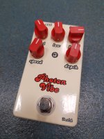
I really do like the gloss and emboss effects. Gloss-V on Julia and Emboss on VfE BumbleBee.
View attachment 9968View attachment 9969
Yes, I’ve done it with complicated graphics that generated a LOT of paths after tracing and it came out great.like this bee printed here except I am printing a peach head graphic - not including the background and text. see attached. I have the ai files for that original art so I assume I can just drop it in and trace?
Awesome! Love the way those turned out. Which trace preset did you use etc? Anything I need to look out for?Yes, I’ve done it with complicated graphics that generated a LOT of paths after tracing and it came out great.
Edit: [example 1] [example 2]
For complicated images, I'd most likely use the High Fidelity Photo and get good results. You can always go tweak the preset in the dedicated windows (or if you want a simpler/different trace).Awesome! Love the way those turned out. Which trace preset did you use etc? Anything I need to look out for?
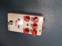
Looking good, reminds me of the line work on the Adventure Audio stuff.Thanks a lot to this thread. Here is my UV printing result. BTW, tayda shipped my order only one day after I placed my order.
View attachment 14472
The left one is using matte black, image is little bit off center (Shall I complain with tadya?). The right one is matte black sand, it is perfect. I think I will probably increase the font size or use bold font next time.

You could do it either way; it depends on the look you're going for. For my pedals so far, I've gone with just doing the gloss varnish on the graphics since I've been doing black on black pedals and want the graphic to subtly pop.When you guys are doing your gloss/matte finishes, are you applying them to the entire face of the enclosure or are you only applying them to any graphics/text you've added to the layout?
I usually do a gloss on only the graphics I've introduced. For the Siren above, the entire artboard was covered in graphics, so I just threw down a solid rectangle in the gloss layer.When you guys are doing your gloss/matte finishes, are you applying them to the entire face of the enclosure or are you only applying them to any graphics/text you've added to the layout?
You're going to need to ensure that none of the strokes are overlapping. The UV printing process doesn't render like a laser printer, it takes each vector literally and will print all of them, overlapping.I'm brand new to illustrator and trying to prep some art for a print. It's I think a pretty simple layout but I'm not sure how to do some of the final steps. I have a bunch of pen strokes that I applied brushes to that are overlapping and I'm not sure if I need to "flatten" them down to make sure that they print with the right transparency/opacity? I also have to knock out a section of dark "ink" to let the white text show through so I just made a copy of the white text (using white as the fill instead of the Roland swatch) and put it in the color layer. I converted all the text to paths so there would be no issue with fonts but other than that I left all the objects and paths as I created them in Illustrator.
I wouldn't mind just sending it and trying out the print, but 10 days is a long time to trouble shoot some art. I exported a PDF of the artwork and then converted that into a JPEG to post here and it looks like I expected it too but I'm a bit nervous about the print process not working like a regular laser printer...

") I will try something more complex next time.
I will try something more complex next time.