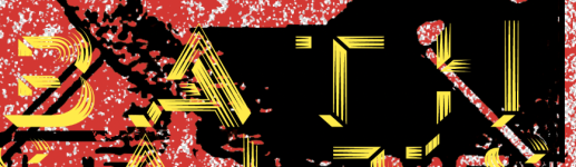
I tried some new things with my latest print/drill and I am really pleased with the results. The pedal is the Narcissus Overdrive (DOD Looking Glass clone).
1. I had heard of people submitting non-vector designs successfully, but was still nervous from all the warnings about it on the Tayda website. The background image on this pedal is NOT vectorized at all and looks great.
2. I tried to make the entire top of the pedal gloss (same area as the background image), but kept getting error messages from Tayda about the GLOSS layer not existing - even though it did. I eventually gave up and printed it without the gloss, but I don't know if they did not like a full gloss or I just submitted something wrong (I have gotten a more sparse gloss layer to work in the past).
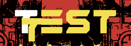
3. Since Tayda now offers cutting straight lines and even encourages people to make interesting designs, I decided to try a bit of an experiment. For unknown reasons I get irrationally upset when my small DC jacks get loose and rotate in the enclosure...which they always seem to since I buy it the cheapest mini DC jacks. I was able to cut a shape that had a flat top and bottom and sides that get close to arcs (but are really small straight lines). It worked! The mini DC jack does not fit as snuggly as I would like, but the concept was a success and the jack still cannot rotate.
View attachment 40391View attachment 40392