Tayda UV printing - On screen color different than print. Color profile problems?

lowpitch

New member
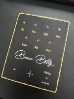
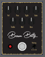
So I had an enclosure for the Brown Betty printed, inspired by the Friedman pedal design. I pulled the RGB color code off the Friedman website and used it in my design. Looks fine on screen, files were all working CMYK, but the print turned out much more yellow. Anybody got an idea what the issue is or any suggestions for a nice Friedman gold?

Now that I uploaded the mockup it has that same yellowish hue... What is going on? How do I display it the correct way within Illustrator? Left is the exported JPG straight out of Illustrator - wrong color, same as the print on the right - middle is a screenshot of how it appears to me in program and what I actually wanted.

brown betty enclosure.jpg Screenshot 2024-09-11 164448.png IMG_20240911_163451.jpg
 
I still have yet to do my first UV print job. But I've started looking into it.

From what I understand, isn't it not possible to display true CMYK on a monitor because the screen is RGB? It's always just an emulation/approximation?

What do folks do- tests print on something? Or just understand they are working with an approximation and adjust accordingly?
 
But then how come the exported JPG in browser looks much more like the printed result compared to the screenshot in the center (how it appears in Illustrator)? There must be some way to display the colors this way within Illustrator.
 
Disclaimer: I don’t want to encourage a copy of a commercial design for a number of reasons. That being said, there are interesting considerations here that are important for understanding print process and digital design.

You’ll need something like a Pantone color bridge and a calibrated monitor to start rendering colors properly. You also need to consider the impacts of the substrate themselves while working in additive printing processes.

Note that RGB to CMYK conversion is not really possible since there are elements of RGB that are not possible to reproduce 1:1 in CMYK. Rather than a straight conversion, you’ll need to emulate the color hue and saturation within a CMYK environment.
 
So I had an enclosure for the Brown Betty printed, inspired by the Friedman pedal design. I pulled the RGB color code off the Friedman website and used it in my design. Looks fine on screen, files were all working CMYK, but the print turned out much more yellow. Anybody got an idea what the issue is or any suggestions for a nice Friedman gold?

Now that I uploaded the mockup it has that same yellowish hue... What is going on? How do I display it the correct way within Illustrator? Left is the exported JPG straight out of Illustrator - wrong color, same as the print on the right - middle is a screenshot of how it appears to me in program and what I actually wanted.
View attachment 81742View attachment 81743View attachment 81744
So what I do is stick to pantone values, both in enclosures and my own colors. You can use a pantone to hex converter. For anything that the color isn't specified I use a color picker browser extension that gives me hex values, but it can be a little tricky due to shadows/highlights.

Now you know, so develop a process to front load these obstacles.

Good luck
 
Thanks for the replies. I guess I had a fundamental misunderstanding about how RGB translates to CMYK. I thought if Illustrator is able to assign CMYK values to a colour without warning it should be printable. But as most things in life it appears it's not that simple 🙃 I also noticed the first image looks even different on my phone compared to on my desktop... Oh man. Almost makes me want to stick to black and white designs only 😄
 
Identify what you don't like about the result, and next time compensate for it in Illustrator. For me, what displays on my monitor always comes out much darker in the print, so I bump my colors (except black) a few notches brighter for the PDF export. Even though it looks "off" in the PDF, the result comes out much closer to what I envisioned.

I think your print looks fine, but if you are dead set on replicating the BE-OD, make the gold color darker and less saturated than the actual color you snagged from the Friedman website. Once you design and print a few more, you will quickly pick up on the differences between Tayda's printer and your own monitor, and you'll be able to estimate any adjustments on the first try. (y)
 
Back
Top