Second set of eyes on Tayda UV print?

rwl

New member
I've made a few pedals with regular enclosures - now I'd like to try UV printing for the first time (for a Caesar pedal). I have a lot of Photoshop experience, but have rarely used Illustrator.

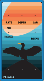
Since I'd done the artwork already in Photoshop, I ended up taking a somewhat different approach than the Steggo tutorial series in order to convert to .ai - trying to to just do an image trace of the entire pedal and then expanding that and trimming to avoid overlapping colors. I checked CMYK and applied the RDG_SWATCH to the white layer (I just did the entire top with white color). I'll print on a light blue background. I really have no idea if I'm missing something that would cause print complications. I've left a few markers for drilling.

A second set of eyes on this would be greatly appreciated!
 

Attachments

  • pelagia.pdf
    148.4 KB · Views: 25
Far from an expert here. I used Affinity Designer for my UV prints, so I opened your file in that. I see a color and white layer. Is there a gloss layer or are you planning on using a gloss layer? Sweet design!
 
Would highly suggest a gloss layer. Not for looks but at minimum protection. UV ink isn't all that tough. See the recent thread about painters tape lifting the UV ink.
Also, be sure you're using the cmyk swatch for color layer in addition to the white.
 
Good idea, I'll add the gloss layer.

There are CMYK swatches? I just set the document color mode to CMYK...
I'm no expert. Not a novice.
But there is a CMYK swatch tayda wants. I think it's the Roland swatch.
Let me see if I can find it.
Like I said, not an expect. Need the Roland swatch for the rgd_white
Here, 1/3 down the page
My bad.
 
Nice looking design! Things look mostly good to me. File dimensions look good and your white layer does show to be RDG_WHITE for me (using Affinity Designer). A couple things I noticed when reviewing the file:

You have a tiny spot where your bird's wing does not fully cover the subtraction:
1719076262137.png

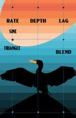
It's minor, but the top drill marks are out of alignment with the layer subtractions below:
1719076646541.png

If your bird is supposed to be black, you may consider looking at the CMYK values for rich black instead of what you have now (0,0,0,100). In my experience, rich black renders a little better in print.

You can also remove your white hexagons on the drill marks at the bottom. White won't print in the color layer and you've already subtracted the color panel behind them. Might as well leave them out, like so:
1719076477998.png

One more thing... Your design is edge to edge on a rectangular art board. When you have this printed, it's going to have hard 90° edges on the curved corners of the enclosure (see below). If you're okay with this, then leave as-is. If you'd prefer to follow a little closer to the contour of a 125B, try setting a radius on the edges of your artwork, leaving the corners transparent.
1719077147700.png

I cannot guarantee that my review of the file is 100% comprehensive, but other than the things mentioned above, it looks good.

EDIT: See following post.
 
Last edited:
I just tried opening the file in Adobe Acrobat Reader which is what I use to do a final check on files before I send them off. I noticed that your file does not show layers in Acrobat Reader. You may need to review your export settings to ensure that you are including layer information and that you're not exporting as some special Illustrator-type PDF (I'm not familiar enough with Illustrator anymore to know all the export formats currently available).
 
  • Like
Reactions: rwl
Thanks Brett - that was a great review. I think I accidentally unclicked "Create Acrobat Layers from Top-Level Layers". Opening a different template with Acrobat, I can see a "layers" icon, but I couldn't see it for this file. So I think I know how to validate that I've set layers correctly in the future.

Those are all really helpful tips - I'll adjust to have a rounded edge in the future and look at the "rich black" color.

Out of curiosity, what shade of white won't print in the color layer? Just CMYK (0,0,0,0)? (ie, if I had CMYK (2,2,0,0) that would print?)
 

Attachments

  • pelagia.pdf
    147.2 KB · Views: 1
So I think I know how to validate that I've set layers correctly in the future.
The new file does show the layers in Adobe Acrobat Reader, good job!

I'll adjust to have a rounded edge in the future and look at the "rich black" color.
The black color that I often use in my designs is CMYK 60,40,40,100.

Out of curiosity, what shade of white won't print in the color layer?
No shades of white will print on the color layer. Anything deviation from pure white will print as a subtle hue on top of whatever is beneath it.

(ie, if I had CMYK (2,2,0,0) that would print?)
Not really. I'll try to explain this the best I can. As it pertains to these UV printing files, white is not a color so it doesn't belong in the COLOR layer. Instead, think of white objects in the color layer as transparency. Whatever is beneath the white object will show instead of white. NOW, if you add a slight hue to the white object you placed in the COLOR layer, in your case CMYK (2,2,0,0), you're only going to see the pigment for the Cyan and Magenta additives on top of whatever is beneath it. If the only thing beneath it is your WHITE (RDG_WHITE) layer, then it will render as intended. Otherwise, it's going to look weird.

Your new file has some potential issues that you may want to address. The curved sections don't fully align to the outside bounds of the art board. Check around the entire perimeter of the design.
1719085264958.png

Edit: I'm guessing at which color blue you'll be using, but I just wanted to reiterate that the finished print (if you keep the general design the same) will look close to this:
1719090038074.png
 
Last edited:
  • Like
Reactions: rwl
Thanks for checking again!

It was a huge pain trying to get things to align with the edge of the artboard (particularly with a bunch of slightly misaligned layers already there). If others have the same problem, Smart guides (Ctrl+U) helped a lot. As did deleting most of the subtly misaligned layers so they weren't used as references for snapping. I was also able to clip off the corners and convert to the rich black Brett mentioned.

Illustrator is very frustrating to me (at least CS6, which is what I'm using). It feels like almost every behavior and hotkey is subtly different from Photoshop...
 

Attachments

  • pelagia.pdf
    150.8 KB · Views: 1
Looking good! A couple last questions for you @m741:

What size knobs are you planning to use on this build?

Are the switch labels intentionally off-center with the switch drill mark?

It appears that some of the labels and drill marks are a little off compared to where they should be. It won't make a huge difference, but some of the labels may appear off-center after drilling:

1719098363641.png
 
I was planning on 15mm knobs, but might try something smaller.

I'm ok with the drill marks being slightly off (I'm just using a hand drill so I'm not super-precise anyway). My process to draw the marks was to take a screenshot of the drill template from the pdf and then paste it in... but i think the borders of the pedal on the screenshot left things slightly off. Of course I'd prefer everything to be more accurate - how did you draw the guidelines in your screenshot? I couldn't find actual measurements of the drill marks in the build docs.
 
I was planning on 15mm knobs, but might try something smaller.
Okay, I just wanted to be sure that you had enough room. When I applied a (commonly used) Davies 1510 knob mockup, it overlapped your control label.

how did you draw the guidelines in your screenshot?
Robert's drill template is 1:1. I just import the PDF into Affinity Designer and line up guides to the drill locations. It helps that I know most of the default dimensions that the PedalPCB templates use, but if ever in doubt, I do it manually using the import & align guides method. It helps to have snapping enabled if you're manually aligning objects to the guides.

Illustrator is very frustrating to me (at least CS6, which is what I'm using).
I used to use Adobe's products but I couldn't justify the subscription cost anymore after closing my previous business. Affinity Designer is easier to use for what I do, but it doesn't have 100% of the features of Illustrator and not everyone cares for Affinity apps. It's a hell of a lot cheaper though.
 
Back
Top